In plain English
There are now hundreds of language models you could call from an API, and each one is a different trade-off between three things you actually care about: how smart it is, how fast it answers, and how much it costs. A model that aces hard reasoning might be slow and pricey; a cheap, snappy model might fumble the moment a task gets tricky. Comparing them by hand means juggling a dozen scattered benchmark pages and pricing tables that all use different units.
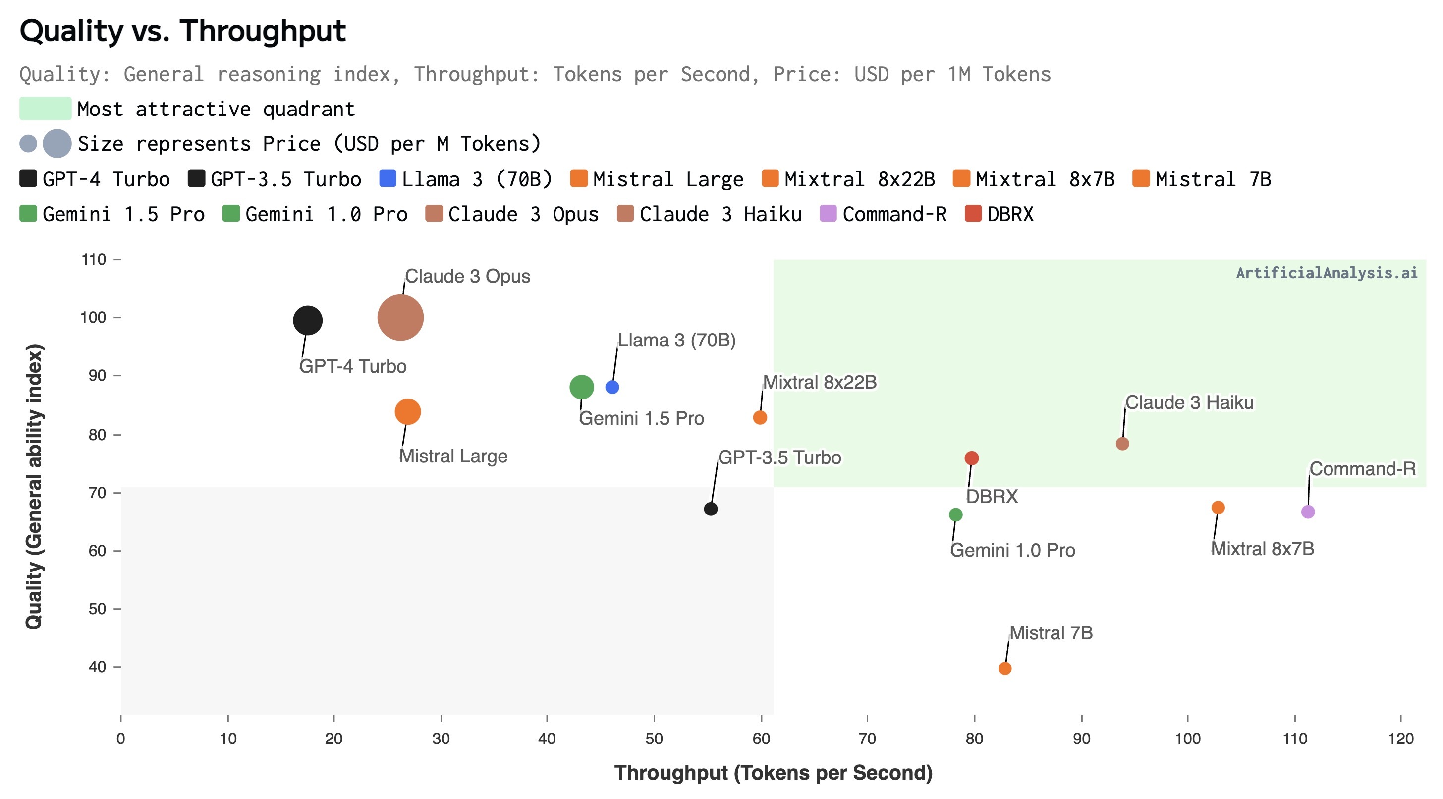
Artificial Analysis is an independent website that does that comparison for you. It runs a standard battery of tests across a large catalogue of models and plots every model on the same three axes — a single combined quality score it calls the Intelligence Index, plus speed and price — so you can see the whole landscape at a glance instead of stitching it together yourself.
Think of it like a car-buying site that puts every model on one chart of horsepower vs. fuel economy vs. sticker price. You still decide which corner of the chart matters for your trip, but you no longer have to read fifty separate brochures to find the cars worth considering. Artificial Analysis is that chart for AI models.
Why it matters
Picking a model is one of the first real decisions you make when building anything with an LLM, and it is genuinely hard to do well. The headline numbers labs publish are easy to cherry-pick, use inconsistent test setups, and almost never put quality, speed, and cost in the same view. Artificial Analysis exists to give builders a neutral, apples-to-apples place to start.
- It makes the trade-off visible. The real question is rarely "which model is best?" but "which model is good enough for this job at a price and speed I can live with?" Seeing quality, speed, and price together is exactly what answers that.
- It standardises the comparison. Each model is run through the same tests and measured the same way, so differences reflect the models, not different benchmark rules. A score is only meaningful next to other scores produced the same way — see how to read a benchmark score.
- It covers the whole field, fast. New models ship constantly. A central dashboard that adds them quickly saves you from re-running your own evaluation suite every time a lab releases something.
- It separates hype from usable signal. A launch post claims a model is "the smartest ever." An independent dashboard lets you check that claim against rivals on neutral ground before you wire it into production.
Who cares? Anyone choosing a model: an engineer picking a default for a product, a team estimating the monthly bill of a chat feature, a founder deciding whether a cheaper model is "close enough" to a flagship. It is a shortlisting tool — it narrows hundreds of options down to a handful worth testing on your own data, which is where the final decision always belongs.
How it works
Under the hood, Artificial Analysis does the same loop for every model: run a fixed set of tests, measure quality, separately measure speed and cost by actually calling the model, then combine the quality results into one index and publish everything to a comparison view. The three axes are measured independently because they answer different questions.
The Intelligence Index: a composite score
The hardest part is reducing "how smart is this model?" to one number. No single test captures intelligence, so Artificial Analysis runs several benchmarks covering different skills — general knowledge, reasoning, maths, coding, and so on — and then merges those results into a single composite score, the Intelligence Index. A composite just means a weighted blend of several sub-scores into one headline figure, the way a credit score blends many signals into one number.
The benefit of a composite is that one weak or one flukey benchmark can't dominate the picture — a model has to be broadly capable to rank high. The cost is that you lose detail: two models can share an index value while being strong at very different things, so the index is a starting filter, not the final word. Many of the underlying tests are well-known public benchmarks; see what are LLM benchmarks for the building blocks.
Speed and price: measured, not a single number
Speed is reported in two parts because they feel different to a user. Throughput is how many tokens per second the model streams once it gets going — this drives how fast a long answer fills the screen. Latency (often "time to first token") is how long you wait before anything appears. A model can be high-throughput but high-latency, or the reverse, so both matter.
Price is normalised to cost per token (usually quoted per million tokens), and input and output tokens are often priced differently. Because the same model can be hosted by several providers at different speeds and prices, a dashboard like this compares providers too, not just the underlying model.
- "Is it capable enough?"
- Composite of many benchmarks
- Higher = broadly smarter
- One number hides per-skill detail
- "Will it feel responsive?"
- Throughput (tokens/sec)
- Latency (time to first token)
- Measured from real API calls
- "Can I afford it at scale?"
- Cost per million tokens
- Input vs output priced apart
- Varies by hosting provider
How to read the dashboard without getting fooled
The most useful views are the scatter plots that put two axes against each other — typically quality vs. price or quality vs. speed. They turn model selection into a simple visual question: for the quality I need, what is the cheapest or fastest option?
On a quality-vs-price chart, the models you want sit toward the top-left: high intelligence, low cost. The straight read is a frontier line — the set of models where you can't get more quality without paying more, or pay less without losing quality. Anything well below and to the right of that frontier is dominated: something else is both smarter and cheaper.
| You care most about… | Look at… | Watch out for… |
|---|---|---|
| Best possible answers | Top of the Intelligence Index | Often the slowest and most expensive |
| Lowest cost at scale | Cheapest models that clear your quality bar | A tiny quality gap can still hurt hard tasks |
| Snappy, real-time UX | High throughput + low latency | A fast model may be weaker on reasoning |
| Best overall value | Top-left of the quality-vs-price chart | "Value" depends on your task mix, not the chart |
A worked example: choosing a model for a support bot
Say you're building a customer-support assistant. It answers from your help docs (so it's a RAG system, and the model mostly summarises retrieved text rather than reasoning from scratch), it handles thousands of chats a day, and users expect replies to start appearing quickly. Here's how the three axes turn into a decision.
- Set a quality floor, not a quality ceiling. Because the docs do the heavy lifting, you don't need the #1 model on the Intelligence Index — you need one comfortably above your floor for summarising and following instructions. That immediately deletes the most expensive flagships from contention.
- Filter by price next. At thousands of chats a day, cost per token compounds fast. On the quality-vs-price chart, scan the models that clear your floor and take the cheapest few. Output tokens usually cost more than input, so a chatty model is a hidden cost.
- Break the tie on speed. Among the survivors, prefer low latency (replies start fast) and decent throughput. For a chat UI, time to first token often matters more to the felt experience than raw tokens per second.
- Shortlist two or three, then test on YOUR data. The dashboard got you from hundreds of models to a handful. The winner is decided by running those finalists against your real tickets and your own evals — never by the leaderboard alone.
Limits and pitfalls
A comparison hub is a fantastic shortlisting tool and a poor final judge. Knowing where it stops being reliable is what separates a good model choice from a cargo-culted one.
- It can't measure your task. No public benchmark tests your domain, your prompts, or your tone requirements. A model that tops the index can still underperform on your specific workload, and a mid-ranked one can be perfect for it.
- Composite scores hide shape. Two models with the same Intelligence Index can be strong at completely different skills. If your job is coding-heavy, the blended number can mislead — drill into the per-benchmark scores.
- Benchmarks leak and saturate. Popular tests get absorbed into training data over time (see benchmark contamination) and top models cluster near the ceiling on older ones, so small index gaps at the top may be noise.
- Speed and price are moving targets. Providers change prices, add hardware, and tune serving constantly. A measured number is a snapshot; re-check it near a real decision rather than trusting a figure you saw weeks ago.
- A leaderboard invites overfitting. When a single ranking matters commercially, there's pressure to optimise for the test rather than for real users — the same overfitting risk every benchmark faces.
Going deeper
Once the basics click, the interesting nuances are about what kind of signal a composite, automated dashboard gives you — and what it deliberately doesn't.
Composite weighting is an editorial choice. Whoever builds the index decides which benchmarks go in and how much each counts. Reweight a coding-heavy benchmark and the rankings shift. There's no single "correct" weighting, so an index reflects its author's view of what "intelligence" means. Always ask what's in the blend before treating the headline number as objective truth.
Automated metrics vs. human preference are different lenses. Artificial Analysis leans on automated, repeatable benchmarks. A site like LMArena instead ranks models by blind human votes converted to Elo ratings. Neither is "more correct" — automated tests are reproducible but can miss what feels good to a person, while human preference captures vibe but is noisier and style-biased. Strong teams read both.
Public vs. private benchmarks. Anything public eventually leaks into training data, which is why serious evaluation keeps a held-out private set the models have never seen. A dashboard's public scores are a great first filter; your own private eval is the trustworthy second stage. The distinction between public and private benchmarks is the single most important idea to carry away here.
Watch the axis you don't care about quietly winning. It's easy to fixate on intelligence and forget that a 2x price difference or a sluggish first-token latency can sink a product even when quality is identical. The whole reason to plot three axes at once is to stop a single dimension from hijacking the decision.
Where to go next: learn what LLM benchmarks are so you understand the tests behind the index, then learn how to read a benchmark score so a number never fools you again. The durable lesson: a comparison hub turns hundreds of models into a shortlist in seconds — but the model you ship is the one that wins on your data, not the one that wins the chart.
FAQ
What is Artificial Analysis used for?
It is an independent dashboard for comparing AI models on three axes at once: a composite Intelligence Index (quality), speed (throughput and latency), and price per token. Builders use it to shortlist which models are worth testing for a given task, rather than reading scattered benchmark pages and pricing tables by hand.
What is the Artificial Analysis Intelligence Index?
It's a single composite score that blends results from several different benchmarks — covering reasoning, knowledge, maths, coding, and more — into one headline number. The point of combining many tests is that a model has to be broadly capable to rank high, so one flukey benchmark can't dominate. The trade-off is that the single number hides which specific skills a model is strong or weak at.
Is Artificial Analysis accurate or trustworthy?
It's a useful, independent starting point because it tests every model the same way and isn't run by the model makers. But it can't measure your specific task, composite scores hide per-skill detail, and prices and speeds change often. Treat it as a shortlisting filter and confirm the final choice with your own evaluation on your own data.
How is Artificial Analysis different from LMArena?
Artificial Analysis ranks models using automated, repeatable benchmarks plus measured speed and price. LMArena ranks them by blind human preference votes turned into Elo ratings. Automated benchmarks are reproducible but can miss what feels good to a person; human preference captures that feel but is noisier. They are complementary lenses, not rivals.
Should I just pick the model at the top of the leaderboard?
Usually no. The top model on the Intelligence Index is often the slowest and most expensive, and a cheaper, faster model may be more than good enough for your task. Decide which axis matters for your use case first, use the dashboard to narrow to a few candidates, then test those finalists on your real data before shipping.